Android 16 may revamp quick settings and notifications panel. This is possible to speculate because Google just made the source code for Android 15 available, allowing developers to have a behind-the-scenes look at how all the new features of the platform are implemented.
Last year, Not every feature that Google worked on was finished in time for the launch of Android 15, and so those modifications won’t be available until the Android 16 upgrade which is expected to arrive in the fall of this year or one of the next quarterly platform updates. The Android 16 is expected to come with some modifications, already the Quick Settings and notification panels on Android have been completely redesigned hence you can be sure of this update.
the present notification and Quick Settings panel design for Android came with the release of Android 12 in 2021 when Google unveiled its Material You design language.
Currently, The Quick Settings and notification panels are combined. Once the status bar is lowered, the full notifications panel and the first four Quick Settings tiles can be accessed. When you pull it down once again, all of the Quick Settings panel and a few notifications are visible. Google has stuck with that design for years now, this has been the way that Quick Settings and notifications have been handled on Android, at least in the stock version as seen in AOSP
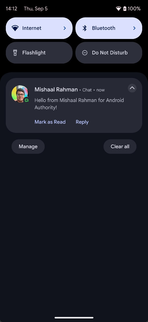
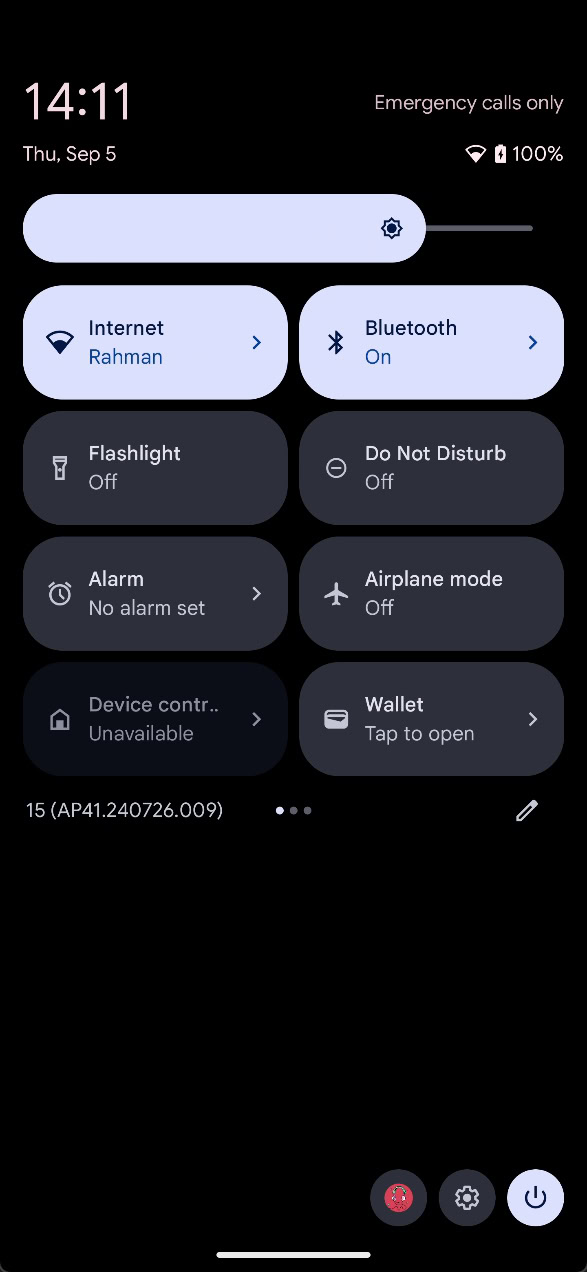
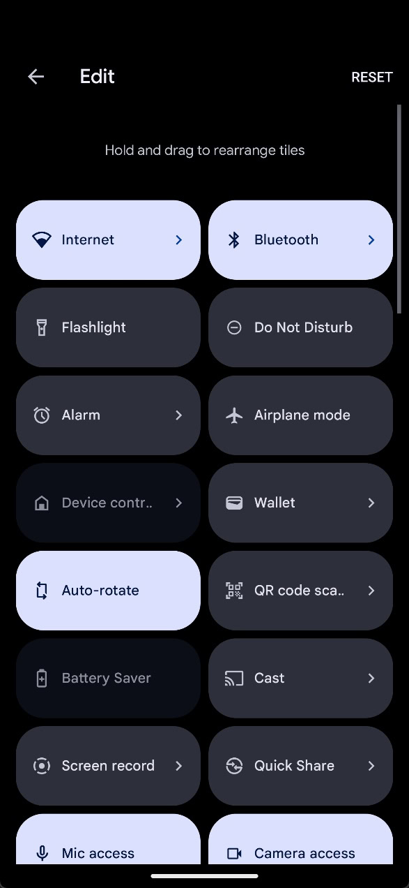
But many Android forks do not handle these two panels this way. For example, Xiaomi claims that a vast majority of its customers prefer HyperOS, which features distinct panels for alerts and Quick Settings.
The decision to divide the Quick Settings and Notifications panels allows the former to display more tiles and buttons and the latter to display more notifications. However, not everyone agrees with this design decision, which is why there was a lot of backlash online when it was rumored that Samsung and OPPO were planning to follow it. Seems like Google is exploring a new dual shade design for Android 16, so it’s not just Samsung and OPPO that want to divide the notification and Quick Settings panels.
While tinkering with the latest Android 15 QPR beta, a user managed to activate a new version of the notification and Quick Settings panels that we believe is intended for the Android 16 release. Pulling down the status bar once still brings down the notifications panel like before, but the panel now takes up about a quarter of the screen, rather than the entire thing. While you can’t see any Quick Settings tiles anymore in the new notifications dropdown, you can see the app that’s underneath the panel.
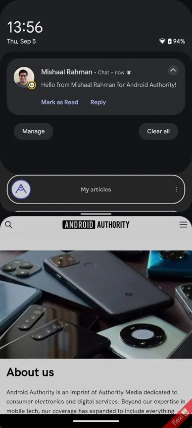
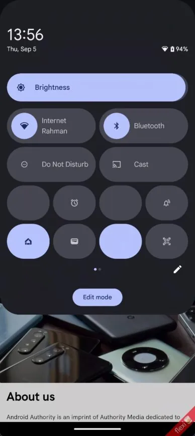
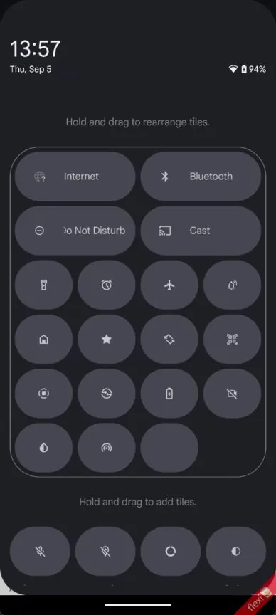
The Quick Settings panel can no longer be accessed by pulling down the status bar twice. Instead, dragging down the status bar with two fingers brings up the Quick Settings window. Since it takes more work to reach your Quick Settings tiles, it’s predicted that the most controversy will stem from this change.
Here’s a breakdown:
- You may view all your tiles by swiping left or right between pages after bringing down the Quick Settings window.
- Just like the new volume sliders in Android 15, the brightness bar still sits at the top but now has a text description and displays the brightness level as you move it.
- It’s a great adjustment that more Quick Settings tiles may now fit on one page thanks to the majority of them being smaller.

There is still more work to be done on this redesign. The user switcher, power menu, foreground service task manager, and icons for numerous tiles are among other items that are still absent. Moreover, because the white writing is invisible in light mode, the panels perform poorly. Light mode support would be a wonderful addition as it isn’t even supported by the present design.
Also Read: NASA Astronomers Predict Near-Earth Asteroid’s 2029 Close Encounter
I think Google is working on new notification and Quick Settings panels for Android 16, and this video shows what they look like:
It’s not certain if Google intends to stick with this specific design, but it’s clear the company is working hard to completely redesign the Quick Settings panel and notification area. However, I sincerely hope that we won’t have to use two fingers to pull down the Quick Settings panel—that would be incredibly unpleasant. What do you think about these anticipated upgrades?


